Royect
Brand identity, applications and website for a custom engineering and development company.
Their promise is direct: turning ideas into real products. Royect arrived with no image of its own and the need to build, from scratch, a brand and a website worthy of its track record.
The identity
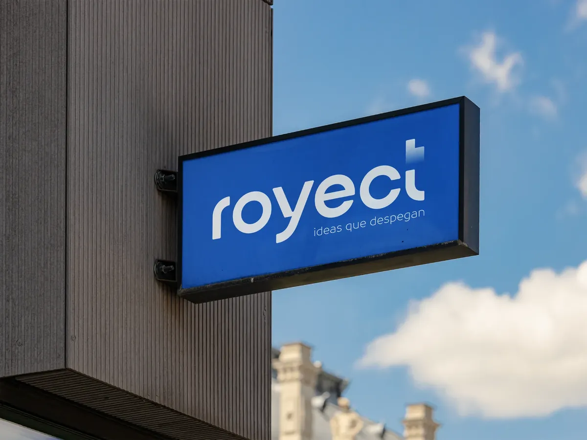
The whole system revolves around one idea: «Ideas que despegan» (“Ideas that take off”). The tagline is not an added slogan, it is the backbone of the brand. The logo makes it tangible: a small blue cube floats above the “t” of royect, like an object mid-launch. Subtle, precise, full of intent.
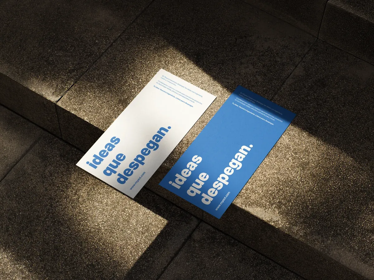
A single blue, intense and flat, that works as well on white as full-bleed. Lower case, plenty of air and one message per piece: the brand says little and is remembered.
Brand applications
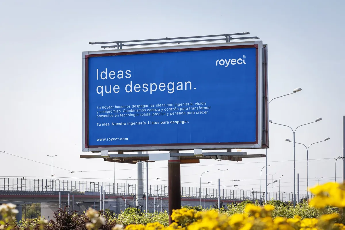
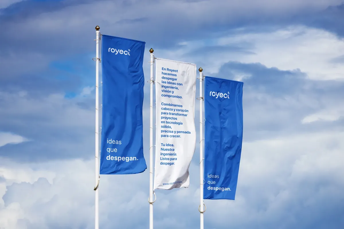
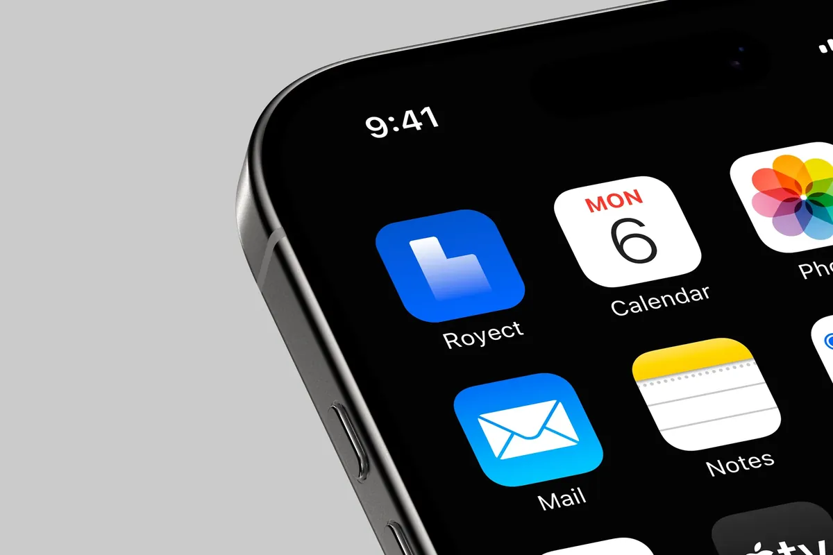
The system unfolds consistently on every medium: signage, billboards, banners, stationery and screens. Royect's brand works just as well at street level as in the user's pocket.
The web design
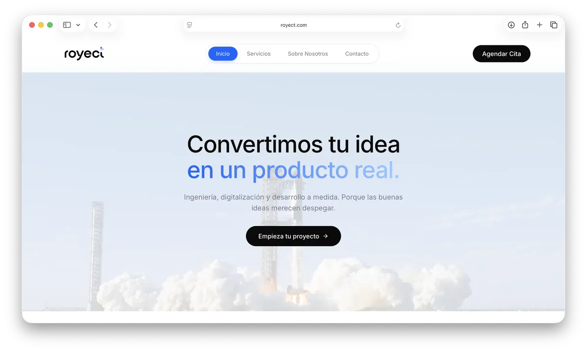
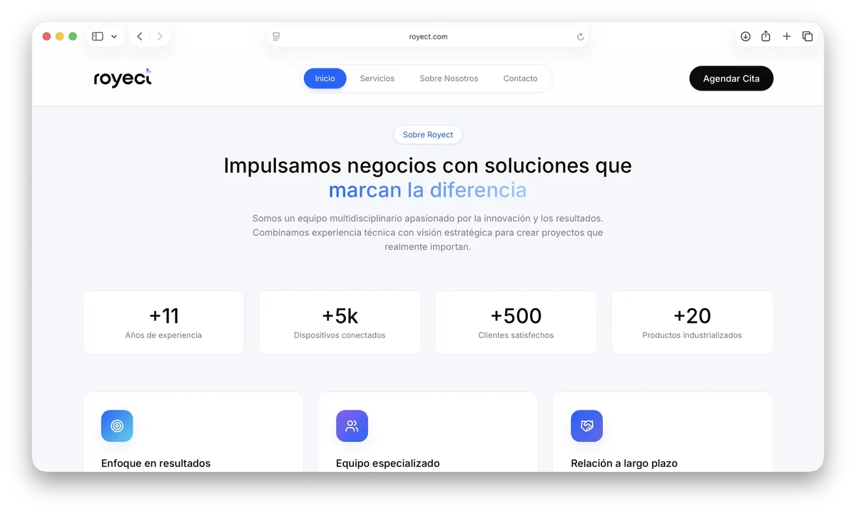
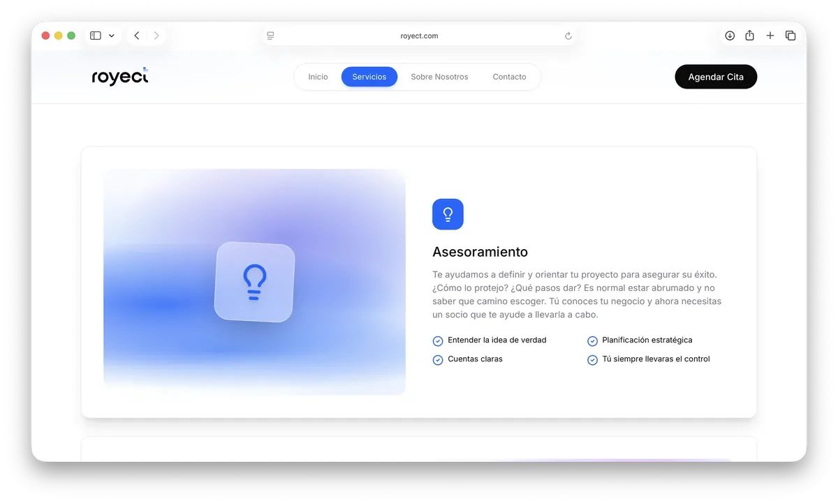
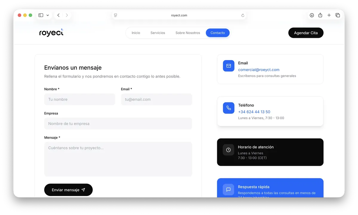
The website translates the identity to the digital environment. A large-format home page with a rocket launch —the take-off metaphor made image—, clean navigation and sections that build credibility with real figures. Everything geared to conversion: the «Empieza tu proyecto» (“Start your project”) call always visible.
royect.com — Home, about, services and contact
A brand that doesn't explain what it does: it shows it in the way it exists.